Plot with hours that have a sign on Libreoffice-Calc
0
votes
1
answer
245
views
On Libreoffice calc I have a spreadsheet that can compute certain quantities in time (hours). These quantities can be positive or negative.
For example, the values in the spreadsheet can be a daily commuting time to work minus an average/nominal value. Thus a negative value in a certain day would indicate that the trip on that day was faster than usual.
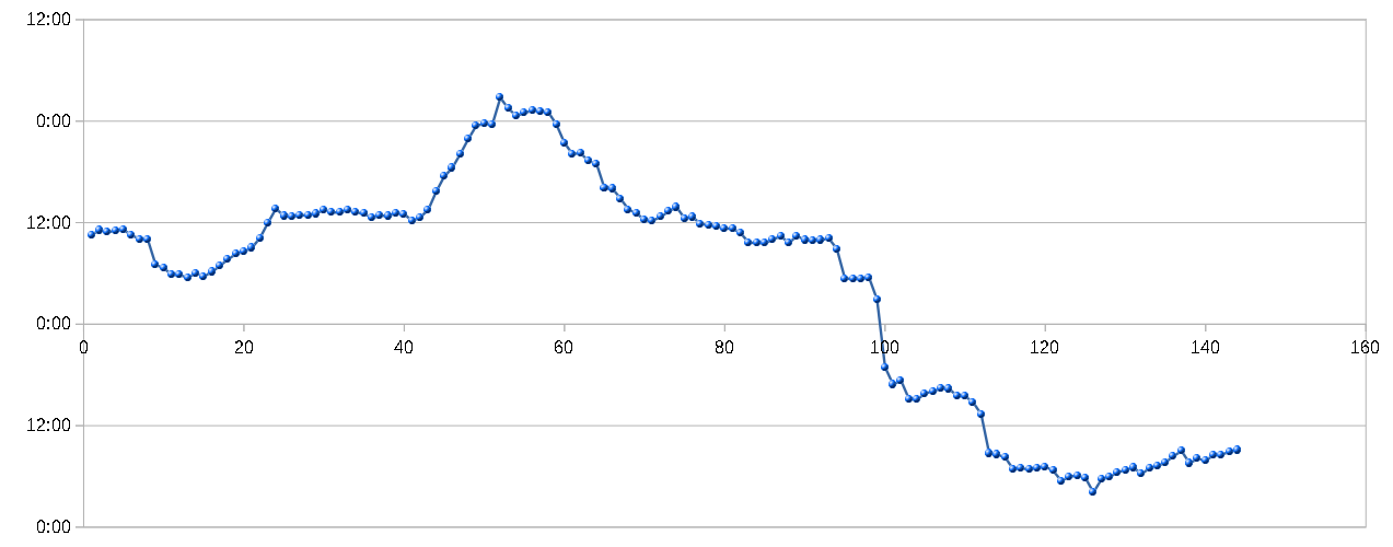
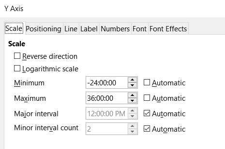
I have also created a plot to visualize this, but I cannot put the correct value on the y-axis. Somehow the values are set with a circular algebra, and if they are above 24 hours the labels on the y axis are resets to 0. Also, the negative values are shown as positive values, while I would like to show them with their sign.
Any clue on how to correctly choose the labels for the y-axis?
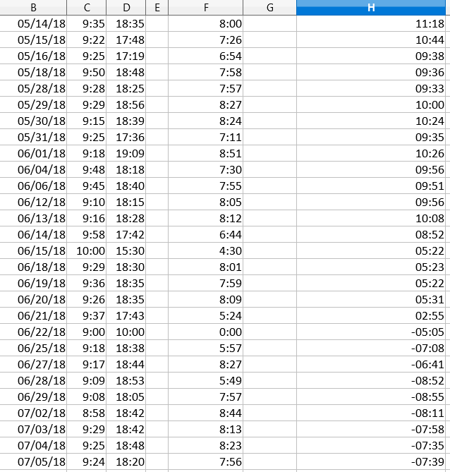
In the figures you see the plot, the y-axis options for that plot and part of the data used for the plot. As you can see, the values on the H column are measured in hours and minutes and they have a sign. Note also the discrepancy between the values on the H column, which are both positive and negative, and the ones in the y-axis, which are only positive.
Asked by cholo14
(103 rep)
Sep 19, 2018, 04:32 PM
Last activity: Sep 20, 2018, 01:06 PM
Last activity: Sep 20, 2018, 01:06 PM