I have created a spreadsheet on numbers to track profit/loss of cryptocurrency investments. I have taken the data for the current value of the cryptocurrency using stock quote so it updates every few minutes. I have a total profit amount at the bottom of the spreadsheet that changes as the figures do. I’d like to create a line graph that shows the profit going up and down over time. I’m not sure how to make the x axis correspond to a date and how to link this with the profit, I don’t really want it to update every few minutes as the figures do but possibly once daily. Can anyone help please? 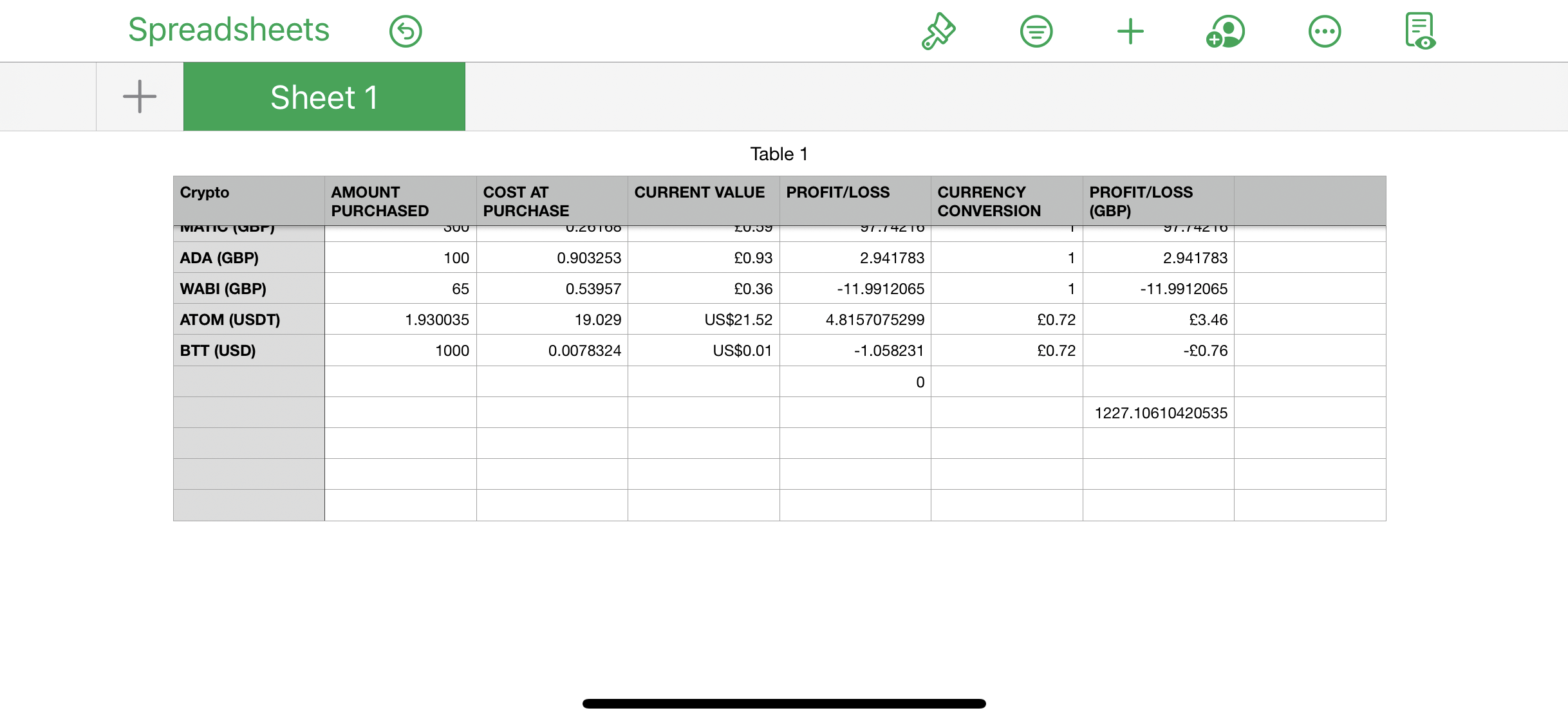
Asked by Sarah
(1 rep)
Apr 29, 2021, 06:45 PM
Last activity: May 29, 2021, 09:03 PM
Last activity: May 29, 2021, 09:03 PM