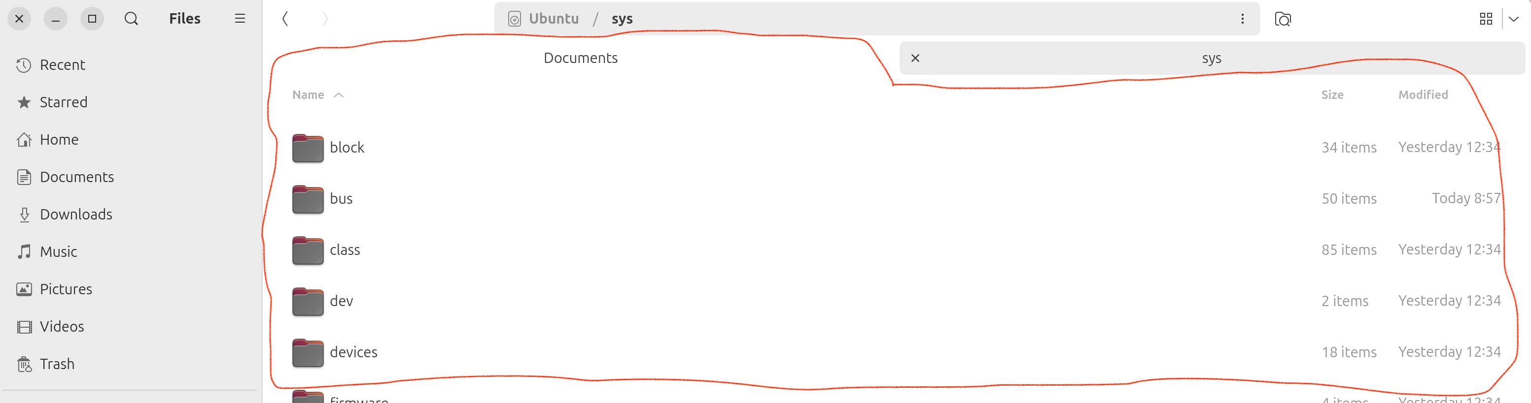
 The currently displayed window forms a single and continuous visual/color space with *inactive* tabs. Like in the example above, the user sees the content/folders of the sys directory, whereas the UI suggests that the user looks at Documents tab, which is misleading
I am trying to get used to it but often find myself pausing for a moment trying to figure out which tab is actually active.
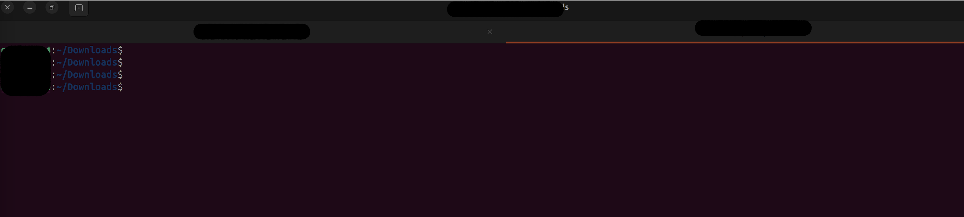
Other applications, such as Terminal, don't have this problem, as an active tab has a a bright underline (see image below) making it obvious which tab is active. In Chromium web browser, the current window forms a continuous visual space (using color and thin borders) with the *active* tab.
Is there any way to change the look of Gnome Files to provide a stronger visual clue for active tabs?
The currently displayed window forms a single and continuous visual/color space with *inactive* tabs. Like in the example above, the user sees the content/folders of the sys directory, whereas the UI suggests that the user looks at Documents tab, which is misleading
I am trying to get used to it but often find myself pausing for a moment trying to figure out which tab is actually active.
Other applications, such as Terminal, don't have this problem, as an active tab has a a bright underline (see image below) making it obvious which tab is active. In Chromium web browser, the current window forms a continuous visual space (using color and thin borders) with the *active* tab.
Is there any way to change the look of Gnome Files to provide a stronger visual clue for active tabs?
Asked by alx958
(21 rep)
May 19, 2024, 04:51 PM
Last activity: May 25, 2024, 05:50 PM
Last activity: May 25, 2024, 05:50 PM