Selection for batch operation in Gmail's new material design
2
votes
0
answers
55
views
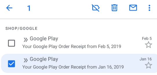
I'm confused, while I'm trying to understand the new Gmail "compact" style user interface. This is the view, where left to the email's 2-line representation a checkbox can be found. I can't really grasp the UI presentation of "selection". Please, take a look at these four screenshots.
1. **Selected and checked**
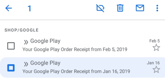
> 2. **Selected but unchecked**
>
2. **Selected but unchecked**
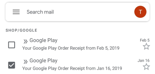
> 3. **Checked but unselected?**
>
3. **Checked but unselected?**
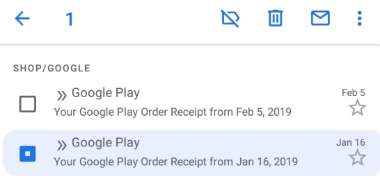
> 4. **Selected and unchecked, but different from (2)**
>
4. **Selected and unchecked, but different from (2)**
> It is clear (from the operation appearing at the upper part of the screen), that 1, 2 and 4 are selections. Why is the UI different in these cases? Also clear, that 3 is **not** selection... but a checkbox has a mark in it, and it normally *used to* mean selection for further operation.
So I'm totally confused, what the UI tries to tell me. Could you please shed some light on what
- checkbox (marked and unmarked state)
- colored background
- thick, and thin frame of the checkbox
mean in the context of email selection?
It is clear (from the operation appearing at the upper part of the screen), that 1, 2 and 4 are selections. Why is the UI different in these cases? Also clear, that 3 is **not** selection... but a checkbox has a mark in it, and it normally *used to* mean selection for further operation.
So I'm totally confused, what the UI tries to tell me. Could you please shed some light on what
- checkbox (marked and unmarked state)
- colored background
- thick, and thin frame of the checkbox
mean in the context of email selection?
2. **Selected but unchecked**
>
3. **Checked but unselected?**
>
4. **Selected and unchecked, but different from (2)**
>
It is clear (from the operation appearing at the upper part of the screen), that 1, 2 and 4 are selections. Why is the UI different in these cases? Also clear, that 3 is **not** selection... but a checkbox has a mark in it, and it normally *used to* mean selection for further operation.
So I'm totally confused, what the UI tries to tell me. Could you please shed some light on what
- checkbox (marked and unmarked state)
- colored background
- thick, and thin frame of the checkbox
mean in the context of email selection?
Asked by austurist
(21 rep)
Feb 8, 2019, 04:27 PM
Last activity: Feb 8, 2019, 04:56 PM
Last activity: Feb 8, 2019, 04:56 PM